
Color is one of the most powerful tools in a web designer’s toolkit. It changes mood, your brand identity, and—most importantly—guides the reader’s eye toward the key information on the page. In WordPress, changing text color has evolved from a simple dropdown menu in a toolbar to a sophisticated system of global styles and block-level controls.
In this in-depth guide, we will explore every method for modifying text color, starting with the modern Block Editor (Gutenberg) and moving through global styles, CSS, and advanced customization.
1. The Modern Way: Using the Block Editor (Gutenberg)
Since the introduction of WordPress 5.0, the “Block Editor” has become the standard. It treats every element—paragraphs, headings, buttons—as an individual block with its own set of style controls.
Changing Color for a Single Block
To change the color of an entire paragraph or heading:
- Click on the block you wish to edit.
- Look for the small Color heading.
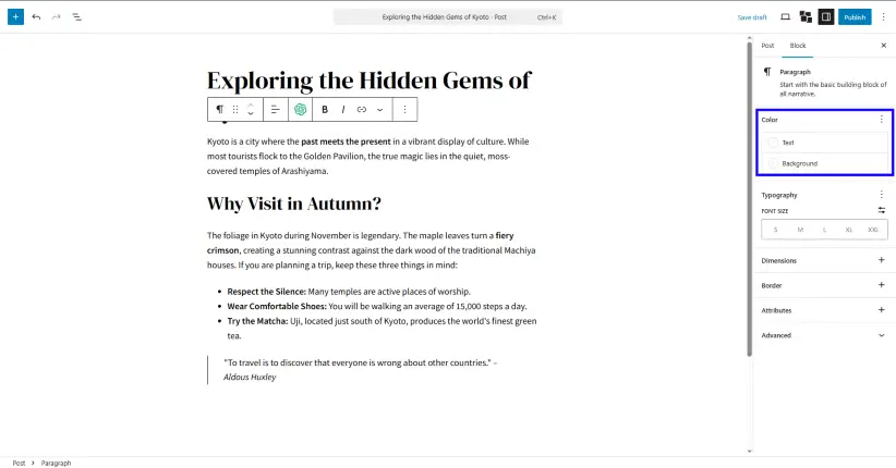
- Click on Text. You will see a palette of theme colors, or you can click the custom color picker to choose a specific Hex, RGB, or HSL value.
Inline Color Changes: Recoloring Specific Words
Sometimes you don’t want to change the whole block; you just want to highlight a single word or phrase.
- Highlight the specific text within the block.
- In the floating toolbar that appears above the text, click the downward arrow (More).
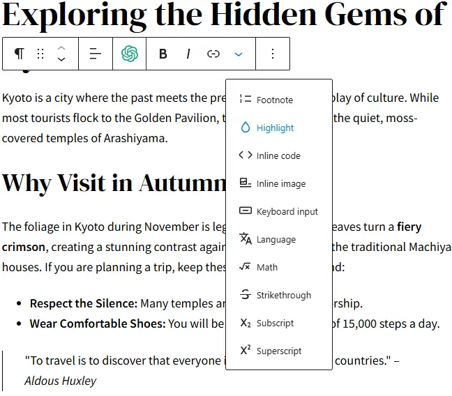
- Select Highlight.
- Choose your text color. Note that you can also set a background “highlight” color here to create a marker effect.
Background Colors and Opacity
The block editor also allows you to set a Background Color for the entire block. When you do this, WordPress will often provide an accessibility warning if the contrast between your text color and background color is too low, ensuring your site remains readable for all users.
2. Global Styles: The “Set It and Forget It” Method
If you find yourself changing every heading to “Navy Blue” manually, you are wasting time. Global Styles allow you to define the color palette for your entire website at once.
For Block Themes (Site Editor)
If you are using a modern “Block Theme” (like Twenty Twenty-Four):
- Go to Appearance > Editor.
- Click on the Styles icon (a half-filled circle) in the top right.
- Select Colors.
- Here you can edit the Palette. By changing the “Primary” color here, every element on your site using that primary color will update instantly.
- You can also drill down into Typography to set the specific default colors for all Headings (H1-H6) or all Paragraphs.
For Classic Themes (The Customizer)
If you are using a classic theme (like Astra, OceanWP, or GeneratePress):
- Navigate to Appearance > Customize.
- Look for a tab labeled Colors or Global Colors.
- Most themes provide a “Base Colors” section where you can set the default link color, text color, and heading colors for the whole site.
3. Changing Colors via CSS (The Developer’s Approach)
Sometimes the editor isn’t enough. Perhaps you want a very specific hover effect, or you want to change colors based on a specific condition. This is where CSS (Cascading Style Sheets) comes in.
Using the “Additional CSS” Field
- Go to Appearance > Customize > Additional CSS.
- To change all paragraph text to a specific grey, you would enter:CSS
p { color: #444444; } - To target only a specific class (which you can add to any block under the “Advanced” tab in the editor), use:CSS
.my-custom-text { color: #ff5733; }
Using CSS Variables
Modern WordPress themes use CSS variables. This allows you to change a color in one place and have it ripple through the site.
CSS
:root {
    --wp--preset--color--primary: #0073aa;
}
4. The Psychology and Accessibility of Color
Choosing a color isn’t just about what looks “cool.” There are technical and psychological factors to consider.
The Importance of Contrast Ratio
The Web Content Accessibility Guidelines (WCAG) require a contrast ratio of at least 4.5:1 for normal text. If you use light grey text on a white background, many users will be unable to read your content.
- Tools to use: Use a tool like the Adobe Color Contrast Analyzer or the built-in WordPress contrast checker to verify your choices.
Color Theory in Web Design
- Blue: Trust, security, and professionalism (Common in tech and finance).
- Red: Urgency, passion, or warnings (Great for “Sale” buttons).
- Green: Growth, health, and peace (Ideal for organic brands).
- Black/Dark Grey: Sophistication and readability.
5. Common Pitfalls to Avoid
- Over-customizing: If every paragraph has a different color, your site will look unprofessional and cluttered. Stick to a 3-5 color palette.
- Hard-coding colors: Avoid using inline HTML (
<span style="color:red">) whenever possible. If you decide to change your brand color later, you will have to find every single instance manually. Use CSS classes instead. - Ignoring Dark Mode: Many users use “Dark Mode” in their browsers. If you set your text color to a very dark grey via a manual block setting, it might become invisible when the browser flips the background to black.
6. Summary of Methods
| Method | Best For | Skill Level |
| Block Editor | One-off changes / highlighting | Beginner |
| Global Styles | Site-wide branding | Intermediate |
| Theme Customizer | Classic themes / global defaults | Beginner |
| Additional CSS | Highly specific / unique effects | Advanced |
By mastering these tools, you move beyond just “using” WordPress and start “designing” with it. Whether you are building a personal blog or a corporate storefront, the ability to control text color with precision ensures your message is not just seen, but felt.