
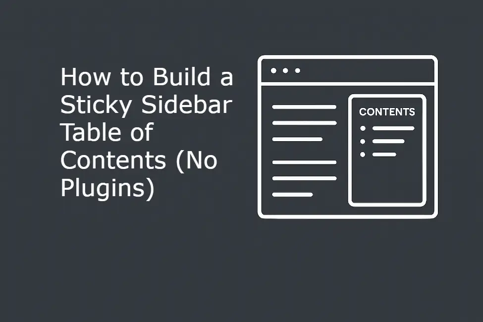
Navigation is the silent backbone of user experience. While a standard Table of Contents (ToC) at the beginning of an article is helpful, a Sticky Sidebar Table of Contents is a game-changer for long-form content. It acts as a constant GPS for your readers, allowing them to jump between complex sections without ever losing their place or having to scroll back to the top.
In this comprehensive 1,200-word tutorial, we are going to build a professional-grade, lightweight sticky sidebar ToC. This tool goes far beyond simple aesthetics—it includes deep customization for trigger points, mobile responsiveness, and orientation.
Why a Sidebar ToC Wins for SEO and Retention
When a user lands on a 3,000-word guide, they often feel overwhelmed. If they can’t find the specific answer they are looking for within seconds, they bounce. A sticky sidebar solves this by:
- Improving “Time on Page”: By making it easy to browse, users stay longer.
- Boosting Search Rankings: Google often uses your ToC links to create “Jump to” links directly in the search results.
- Professionalism: It gives your WordPress site the polished feel of high-end documentation sites like Stripe or Airbnb.
Part 1: The Sticky Sidebar Generator
Use the tool below to configure your sidebar. We have included advanced logic so you can choose exactly when the sidebar appears (scroll depth), which side of the screen it sits on, and how it behaves on mobile devices.
<!-- STICKY SIDEBAR TOC -->
<div id="sidebar-toc-container" class="toc-hidden">
    <div class="toc-title">On This Page</div>
    <ul id="sidebar-toc-list"></ul>
</div>

<script>
(function() {
    const triggerHeight = 400;
    const tocContainer = document.getElementById('sidebar-toc-container');
    const list = document.getElementById('sidebar-toc-list');
    const headings = document.querySelectorAll('article h2, main h2, .entry-content h2');

    headings.forEach((h, i) => {
        const id = h.id || 'toc-seg-' + i;
        h.id = id;
        const li = document.createElement('li');
        li.innerHTML = `<a href="#${id}">${h.innerText}</a>`;
        list.appendChild(li);
    });

    window.addEventListener('scroll', () => {
        if (window.scrollY > triggerHeight) {
            tocContainer.classList.add('toc-visible');
            tocContainer.classList.remove('toc-hidden');
        } else {
            tocContainer.classList.remove('toc-visible');
            tocContainer.classList.add('toc-hidden');
        }
    });
})();
</script>

<style>
#sidebar-toc-container {
    position: fixed; top: 100px; width: 220px; padding: 20px; font-family: sans-serif;
    transition: opacity 0.4s, transform 0.4s; z-index: 999;
    background: #fff; border: 1px solid #eee; border-radius: 12px; box-shadow: 0 10px 25px rgba(0,0,0,0.05);
    right: 20px;
}
.toc-hidden { opacity: 0; transform: translateY(20px); pointer-events: none; }
.toc-visible { opacity: 1; transform: translateY(0); }
.toc-title { font-weight: 700; margin-bottom: 15px; color: #333; font-size: 14px; text-transform: uppercase; letter-spacing: 1px; }
#sidebar-toc-list { list-style: none; padding: 0; margin: 0; }
#sidebar-toc-list li { margin-bottom: 10px; font-size: 13px; border-left: 2px solid #eee; padding-left: 10px; }
#sidebar-toc-list a { text-decoration: none; color: #666; transition: 0.2s; }
#sidebar-toc-list a:hover { color: #000; }
@media (max-width: 1024px) { #sidebar-toc-container { display: none; } }
</style>
Part 2: Understanding the Logic
The Scroll Trigger (triggerHeight)
A common mistake in sidebar design is showing the ToC immediately. If the user is looking at your hero image or intro paragraph, a sidebar is distracting. In the code above, the triggerHeight variable (customizable in the tool) dictates the pixel depth at which the ToC fades in. 500px is usually the sweet spot—it appears just as the user begins reading the main body content.
The Headings Selector
The JavaScript scans for h2 elements. Why only h2? Sidebar space is limited. Including h3 and h4 tags often makes the sidebar too long, causing it to overlap with your footer. We have targeted common WordPress wrappers like .entry-content to ensure it doesn’t accidentally pick up “Related Posts” or sidebar widget headings.
Part 3: Deep Customization & Responsive Settings
Left vs. Right Placement
The side of the screen matters for “F-Pattern” reading.
- Right Side (Standard): Most popular for blogs. It stays out of the way of the primary text line, acting as a secondary reference.
- Left Side (Documentation Style): Better for technical guides or wikis where the user needs to jump between sections constantly.
Mobile & Tablet Display
By default, sidebars are hidden on mobile because they obscure the actual text. However, our “Show on Mobile” option converts the sidebar into a standard, non-fixed block at the top of the post. This ensures that mobile users still get the navigation benefits without the UX nightmare of a floating box over their tiny screen.
Part 4: Installation Guide
To put this live on your WordPress site:
- Open your Post/Page: Go to the editor.
- Add a “Custom HTML” Block: Place this block at the very top or bottom of your content (the position doesn’t strictly matter because the CSS handles the “fixed” placement).
- Paste & Update: Paste the generated code from the tool above.
- Verify Scroll: View the live page and scroll down to your chosen pixel depth to watch the ToC fade in.